A major federal agency contracted with my company to maintain and enhance the website used for internal training of the entire staff of the agency. While this work involved many moving parts, my involvement was primarily in wireframing, prototyping and visually designing new features and enhancements. While these permeated the entire site and are difficult to illustrate given the technical constraints of the system and the piecemeal nature of the implementation, it’s instructive to see how we tackled incremental improvements to certain parts of the site.
Unfortunately, this site is no longer accessible to the public.
Discussion Boards
While the site already had discussion boards implemented, they were a strictly out-of-the-box implementation of an open-source forum tool. We were able to plan and implement some changes to this system to help improve user discovery of new groups/forums; these plans can be seen in interactive wireframes produced in Axure RP »
Badge System
One new feature implemented during our engagement was the creation of a “badge” system to encourage user participation in forums and other parts of the site. Implementing this involved creating some new pages as well as grafting new information onto existing screens (such as the discussion boards) to indicate how involved users were by classifying into tiers based on their activity.
Mockups were done focusing on how the badge system could be displayed to users within their profile management screens:
I also did mockups of how the “tiers” users were assigned to based on their badge acquisition progress would be shown throughout the site, such as within the aforementioned forums:
Finally, I also designed the iconography for the badge tiers the client ultimately decided on: acorn (bronze), sapling (silver), and oak (gold).
Other Screens
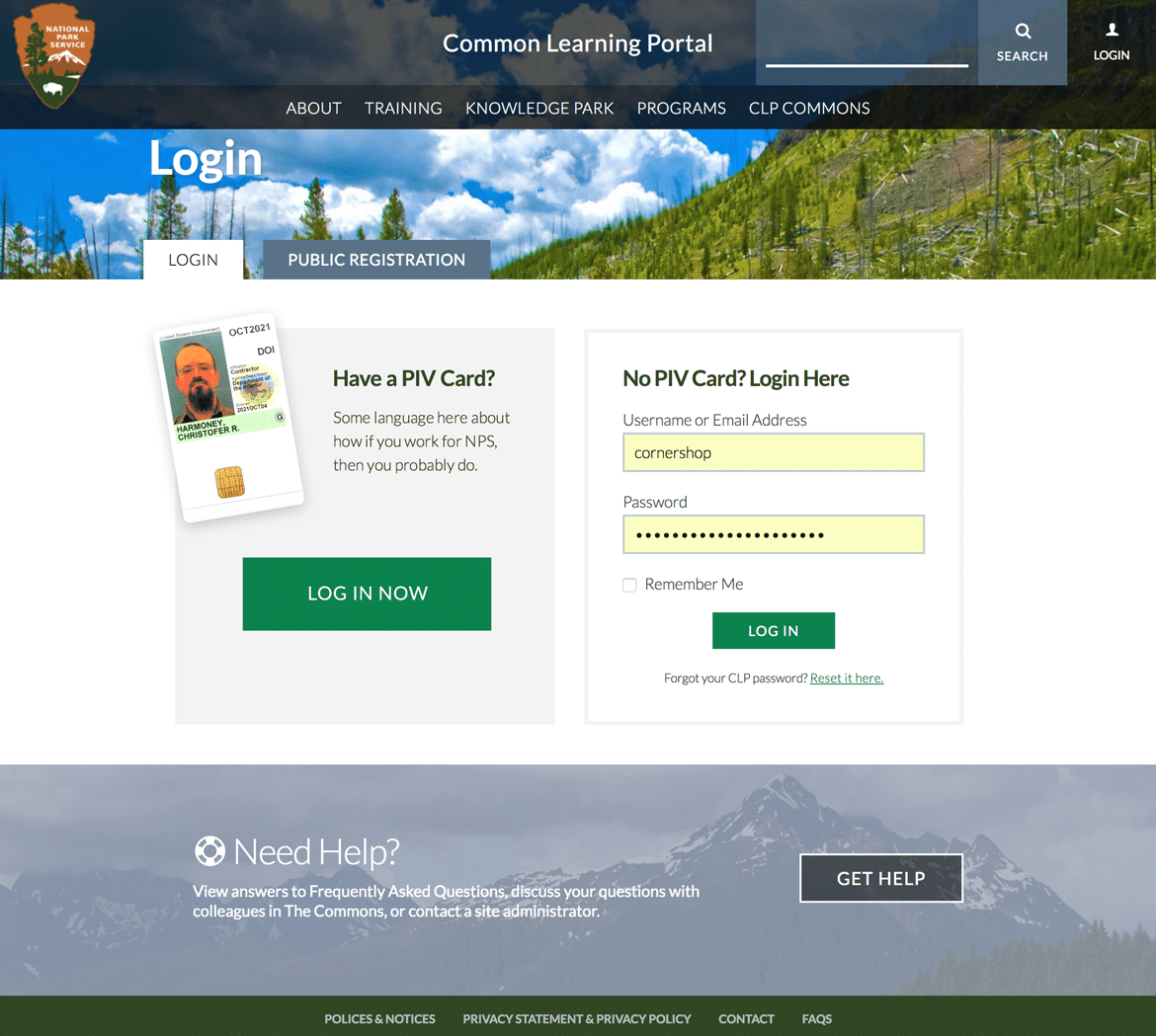
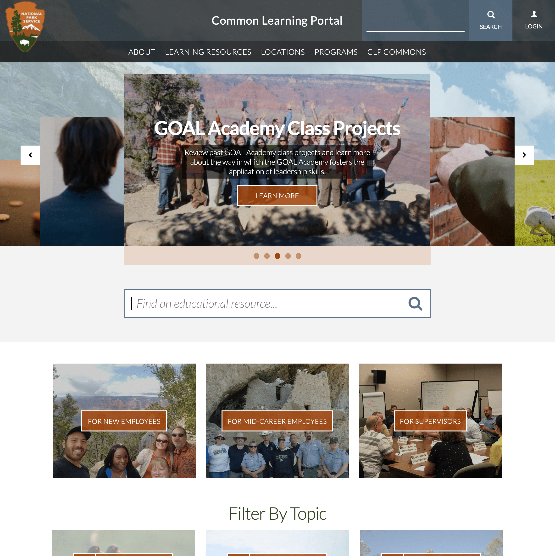
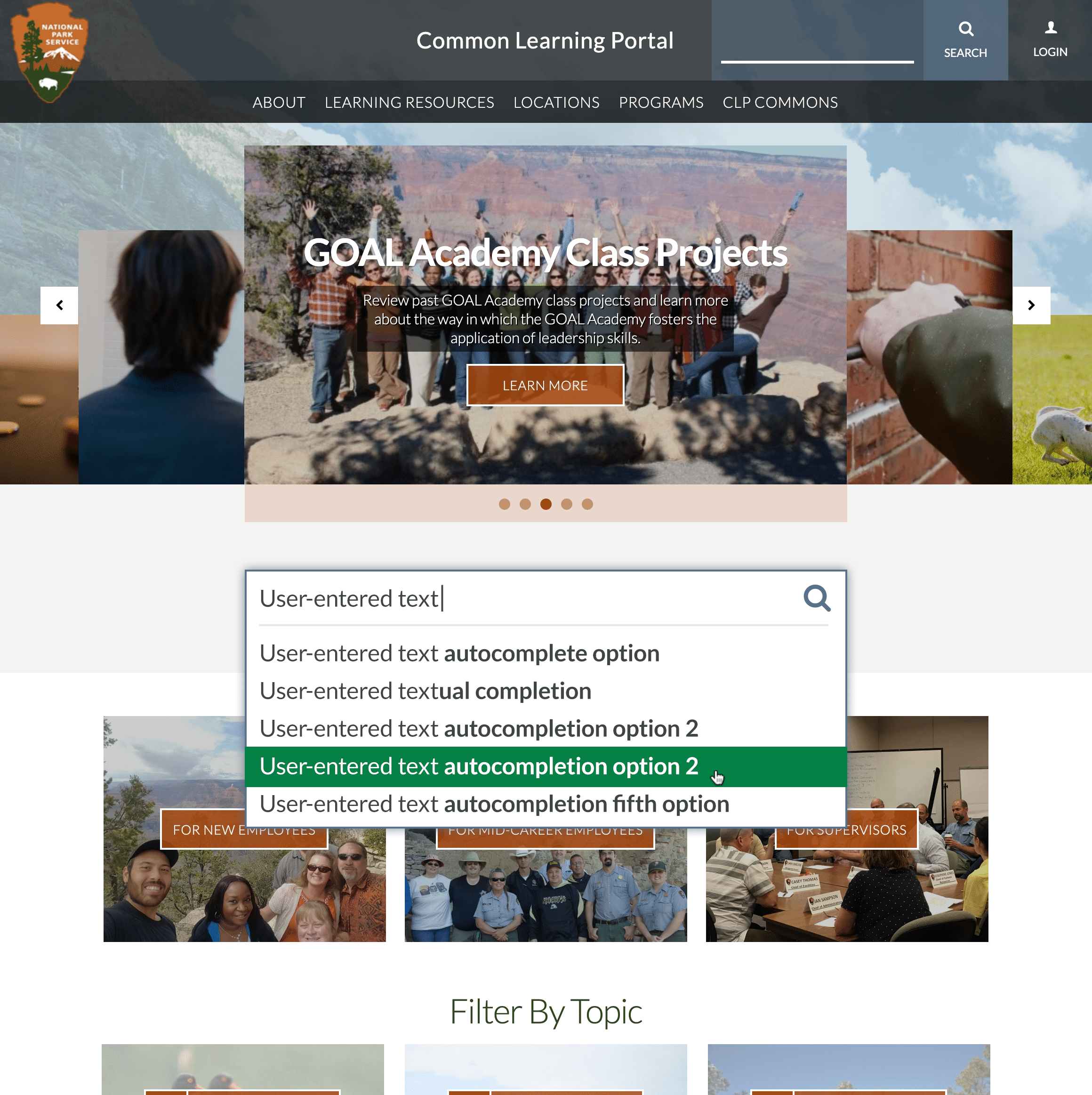
While design tweaks and improvements were performed throughout the site, two of the more notable included designing a search-with-autocomplete form for the site homepage, and revamping the login screen to more clearly explain to confused users how to go about logging in depending on their employee status.